we want you to a design Phoenix Strip! ..
Rules!
1. Design a strip.
2. Include Sponser
3. Post the image in this topic.
3. One Entry per person!!!.
4. No Copyright Images
5. Must Be relistic and serious "For Final Entry"
ENTRYS CLOSE: 25Th June
PUBLIC POLL VOTE STARTS: 26TH June - 10th
July
I want final copy of your entry Sent to Nath815@hotmail.com along with
your Yellowfever username.
please feel free to put watermark through your design so no
one can copy you!
PRIZE= i am currently looking for someone that can make me a
signiture for the winner of this contest..please email me if your
interested
Have Fun!!!!
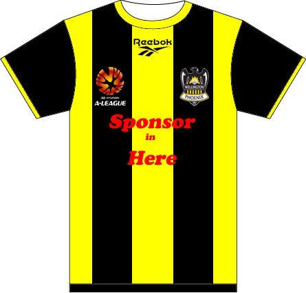
HERES THE TEMPLATE:

Permalink
Permalink
I'm assuming this one doesn't have to be within the rules of the
Reebok template? 
Permalink
Permalink
1st July. will post a template now!!! Rebox sponser
Permalink
Permalink
OK so it's got to be within the template .. . .
Stripes or Hoops everybody!!!! Let's make the template work
for us!

Permalink
Permalink
editing now!YellowFever2007-06-13 11:48:45
Permalink
Permalink
Not sure about stripes or hoops. I might go for spots instead.
Permalink
Permalink
IF any one would like a template of the back i will post also
Permalink
Permalink
SO let me clear this up (I have the flu and am not thinking right
at the moment)
We can have stripes, hoops, etc?
We can have stripes, hoops, etc?
Permalink
Permalink
I think I'm...*feeling queasy*...gonna be...*barf*...too
late.
Permalink
Permalink
What program did you use? I imagine everyone will be submitting
stripes. 
Permalink
Permalink
Adobe Photoshop to draw the shirt.
I sourced the logos from online, various locations.
Permalink
Permalink
My first suggestion:
nice. classic. you have my vote. 
Permalink
Permalink
Heres my first go
Sorry, no stripes yet

Cheers
Sorry, no stripes yet
Cheers
Permalink
Permalink
This aint a competition I started - so dont expect a prize!
Founder
Permalink
Permalink
This aint a competition I started - so dont expect a prize!
cheap.
Permalink
Permalink
Surely somebody can make some kind of signature, avatar or title
that the winner can display to show they won the strip design
contest?
Permalink
Permalink
Where are we sposed to send/email our entries? what do we win if
ours is chosen? im shocked no-one picked up on the sketchy details
that were given
Permalink
Permalink
heres mine:
 [/URL]
please forgive the poor quality, cant afford photoshop so its all MS paint. btw, those lines on the sleeve shouldnt be there, stupid internet
gings2007-06-13 13:53:49
[/URL]please forgive the poor quality, cant afford photoshop so its all MS paint. btw, those lines on the sleeve shouldnt be there, stupid internet
gings2007-06-13 13:53:49
Permalink
Permalink
I like it. It needs a decent amount of Yellow or YellowFever would
be a silly name for the Fan Club. If I remember rightly most home
kits are darker and away kits are generally white.
Its no longer a problem.
Permalink
Permalink
My first suggestion:
Great shirt. Really sharp.
Permalink
Permalink
My first suggestion:
That has to be your next strip. It's awesome.
You could be nicknamed the bumble bees and sing the old
Lindsey Yeo "Buzz O. Bumble" song!! Anyone else remember that, or
am I just too old?
Permalink
Permalink
From the moment I saw this contest, I thought to myself that the
best design with black and yellow stripes would win, considering
it's what you all wanted. I was working on it, but I got beaten.
And phils is pretty sharp, so I'd be confident if I was him.
So I thought I would go with a unique design, hope you like it!

I personally thought it looked better without a silly "SPONSOR GOES HERE" message across the box, because thats a bit obvious.
victorytilidie2007-06-13 16:13:09
So I thought I would go with a unique design, hope you like it!
I personally thought it looked better without a silly "SPONSOR GOES HERE" message across the box, because thats a bit obvious.
victorytilidie2007-06-13 16:13:09
Permalink
Permalink
My first suggestion:
Great shirt. Really sharp.
Hey jmsimons,
I see you're a Sunderland fan. I know the other one in NZ if
you want his number :-)
Toffeeman2007-06-13 16:28:16
Its no longer a problem.
Permalink
Permalink
. And phils is pretty sharp, so I'd be confident if I was him.
In spite of the fact that I was first to post the "stripes"
shirt, I stake no claim for being the designer. In fact the idea
was mooted by other voices than mine in thes forums. I just wanted
to make sure a nice clean example was done first, so that folks
wouldn't gte put off.
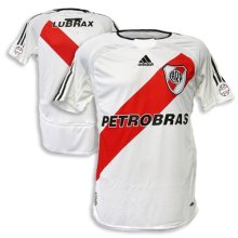
I actually really like your design. I was thinking of doing
a diagonal stripe like the River Plate shirt "
http://www.infofootballonline.com/top_football_teams/jersey_river.jpg
Yours is a good adaptation of that idea.
Permalink
Permalink
i love the thought of having stripes next time round and agree that
we need more yellow, however, CCM wear predominantly yellow, thus
us currently having mostly black...maybe we should have replaced
the yellow on the logo with gold.
i hope Terry sees this thread and takes note for next time round (reebok contract finishes end of this year doesnt it?)
i hope Terry sees this thread and takes note for next time round (reebok contract finishes end of this year doesnt it?)
Permalink
Permalink
From the moment I saw this contest, I thought to myself that the
best design with black and yellow stripes would win, considering
it's what you all wanted. I was working on it, but I got beaten.
And phils is pretty sharp, so I'd be confident if I was him.
So I thought I would go with a unique design, hope you like it!
I personally thought it looked better without a silly "SPONSOR GOES HERE" message across the box, because thats a bit obvious.
So I thought I would go with a unique design, hope you like it!
I personally thought it looked better without a silly "SPONSOR GOES HERE" message across the box, because thats a bit obvious.
Looks a bit like the vasco da Gama shirt from Rio. Not a bad
style although i prefer stripes too, I like Gings design but any
stripe design would get my vote over just black with a drop of
yellow.
Botafogo - Rio de Janeiro and Wellington Phoenix, my two teams til death do us part.
Permalink
Permalink
Mine


that is cool
I really like the Brazilian-style multiple stripe shirt (i.e. Gremio)
Permalink
Permalink
I am not very artistic, or any good with computers, but I will give it a go.
It will be up shortly, and I am sure it will blow your mindsFrankie Mac2007-06-14 13:04:27All I do is make the stuff I would've liked
Reference things I wanna watch, reference girls I wanna bite
Now I'm firefly like a burning kite
And yousa fake fuck like a fleshlight
Permalink
Permalink
here it is.........

All I do is make the stuff I would've liked
Reference things I wanna watch, reference girls I wanna bite
Now I'm firefly like a burning kite
And yousa fake fuck like a fleshlight
Permalink
Permalink
 ok, without photoshop
this isn't easy! even chucked CC in there for Tel hahahaha
Barber212007-06-14 13:32:26
ok, without photoshop
this isn't easy! even chucked CC in there for Tel hahahaha
Barber212007-06-14 13:32:26
Permalink
Permalink
FrankieMac's got my vote. Are you in marketing cause thats
cheating. GeniusToffeeman2007-06-14 13:35:15
Its no longer a problem.
Permalink
Permalink
ok, without photoshop
this isn't easy! even chucked CC in there for Tel hahahahaThis idea has promise. I like in inverted logos down the side,
half on fron, half on back. Do you mind if I have a play with this
idea in photoshop?
Permalink
Permalink
the bits on the side didnt come out how i would have
liked........supposed to be more of a watermark......on the black
side it would be a glossy shiny black and the same on the yellow
half.
sure by all means mate - Yellow Fever "One Band, One Sound"
Carny
sure by all means mate - Yellow Fever "One Band, One Sound"
Carny
Permalink
Permalink


nice try...lol... um um something with a more professional look...
Permalink
Permalink