Wellington Phoenix Men

2011/12 Kits

438 replies · 19,856 views
over 15 years ago · edited over 13 years ago
I don't know what they'll look like, but I'd like to thank with the brand they are using they will look sick.

I'd need to make something like this to be Wyners:

Don't we have to win something before we start putting stars on our shirts?


Permalink Permalink
over 15 years ago · edited over 13 years ago
Away shirts: Instead of the yellow and black stripes of the home shirt, they should have black and yellow stripes for the away shirt.
 
By the way Simon, the watermark on your shirt is the All Blacks fern.
Permalink Permalink
over 15 years ago · edited over 13 years ago
Away shirts: Instead of the yellow and black stripes of the home shirt, they should have black and yellow stripes for the away shirt.
 
 
and that would be different how??  The whole point of an away shirt is that it doesn't have the colours of the home shirt so doesn't clash.
Permalink Permalink
over 15 years ago · edited over 13 years ago
I think he was joking.....
Permalink Permalink
over 15 years ago · edited over 13 years ago
whooooooo wrote:
I think he was joking.....
Oh, ok 
Permalink Permalink
over 15 years ago · edited over 13 years ago
Yes I was, nice to catch someone at least
Permalink Permalink
over 15 years ago · edited over 13 years ago
Away shirts: Instead of the yellow and black stripes of the home shirt, they should have black and yellow stripes for the away shirt.
�

By the way Simon, the watermark on your shirt is the All Blacks fern.


It's not my shirt. It was a Wyners design.
Permalink Permalink
over 15 years ago · edited over 13 years ago
Pale green away strips, just like '82.

Please.
You know we belong together...

Permalink Permalink
over 15 years ago · edited over 13 years ago
I still dont like it when we play CCM, their home shirt predominantly yellow, their away shirt predominantly yellow. Good grief, no imagination at CCM.
 
And does anyone else think that the Hearts kit would look much better with black shorts instead of red?
 
 
And perth would look better if their stripes were like ours and all the way around the jersey?
Proud to have attended the first 175 Consecutive "Home" Wellington Phoenix "A League" Games !!

The Ruf, The Ruf, The Ruf is on Fire!!

Permalink Permalink
over 15 years ago · edited over 13 years ago
Im sorry LG.
But I disagree with all of that.
Permalink Permalink
over 15 years ago · edited over 13 years ago
What? The colour clashes we have with CCM?
Proud to have attended the first 175 Consecutive "Home" Wellington Phoenix "A League" Games !!

The Ruf, The Ruf, The Ruf is on Fire!!

Permalink Permalink
over 15 years ago · edited over 13 years ago
Mariners home -predominantly navy blue.
Mariners away, Yes - Yellow. But is a very cool shirt. No other team has one of that style.

Hearts kit good with red. As no black in logo.
Perth's shirt looks good with all purple back. Plus it's a reflection on all their old home kits.
Permalink Permalink
over 15 years ago · edited over 13 years ago
Lonegunmen wrote:
I still dont like it when we play CCM, their home shirt predominantly yellow, their away shirt predominantly yellow. Good grief, no imagination at CCM.
 
And does anyone else think that the Hearts kit would look much better with black shorts instead of red?
 
 
And perth would look better if their stripes were like ours and all the way around the jersey?
Yes, I agree with you LG about the Mariners. They have quite wide yellow stripes in the home kit and then totally yellow away shirt. Mental!!
 
I think Heart probably would look better with black shorts but they're the colours they've chosen and they're not Brentford or Southampton.
Permalink Permalink
over 15 years ago · edited over 13 years ago
whooooooo wrote:
i'm only talking about the solid colour. like the Nolan one.


I actually agree with Whooooooo on this one. Solid black back with white numbers. Looks so much better than the black box unless you then pay the extra and get a name and number printed on.
Permalink Permalink
over 15 years ago · edited over 13 years ago
Reebok is so average compared to Nike, Adidas and Puma kits. one thing I dislike about the current strip is the collar is a different yellow to the rest of the top? I think the collar should've just been the one colour, maybe even white? But I'm dead keen for an Nike, Puma or Adidas stripey!Luis Garcia2010-09-12 21:29:26
Permalink Permalink
over 15 years ago · edited over 13 years ago
Same one i made and posted before last year

HK_Keeper2010-09-13 22:49:28
Permalink Permalink
over 15 years ago · edited over 13 years ago
Home strip - Solid black sleeves, white collar, stripes (Similar thickness to current strip, black box which doesn't interfer with the stripes like the current one.); Black shorts; white socks.

Away Shirt - Pale green shirt with collar; white shorts and socks.
You know we belong together...

Permalink Permalink
over 15 years ago · edited over 13 years ago
whooooooo wrote:
f**k off it does......


It looks a baby's bib bro. A bit sh*t.
 
Permalink Permalink
over 15 years ago · edited over 13 years ago
Oska wrote:
Home strip - Solid black sleeves, white collar, stripes (Similar thickness to current strip, black box which doesn't interfer with the stripes like the current one.); Black shorts; white socks.
[/QUOTE]
Sorry Oska, no to solid black sleeves (from 2007-2009):


= a disastrous season

[QUOTE=Oska]Away Shirt - Pale green shirt with collar; white shorts and socks.


I prefer a white shirt, with a "phoenix" on a ball. Here's one I prepared earlier:


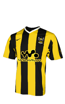
"Phoenix till they lose"

Posting 97% bollox, 8% lies and 3.658% genuine opinion. 

Genuine opinion: FTFFA

Permalink Permalink
over 15 years ago · edited over 13 years ago
White = Classy, but yawn.

Black sleeves = Neat
You know we belong together...

Permalink Permalink
over 15 years ago · edited over 13 years ago
This shirts cool imo
Permalink Permalink
over 15 years ago · edited over 13 years ago
bloody aweful.....IMO

Queenslander 3x a year.

Permalink Permalink
over 15 years ago · edited over 13 years ago
theprof wrote:
bloody aweful.....IMO


haha, I like it for some reason
Permalink Permalink
over 15 years ago · edited over 13 years ago
I'll accept your bias, and stick to my bloody aweful comment....and besides we don't want to have too many teams with sashes on their shirts.....one is enough

Queenslander 3x a year.

Permalink Permalink
over 15 years ago · edited over 13 years ago
whooooooo wrote:
i'm only talking about the solid colour. like the Nolan one.


I prefer the Taylor type back  myself
Permalink Permalink
over 15 years ago · edited over 13 years ago
I like the bottom one....

Queenslander 3x a year.

Permalink Permalink
over 15 years ago · edited over 13 years ago
Adidas:

skylab892010-09-23 16:19:30
Permalink Permalink
over 15 years ago · edited over 13 years ago
Anything without stripes = no.
Permalink Permalink
over 15 years ago · edited over 13 years ago
Look at the crest - stripes.  Get with it. Stevo2010-09-23 20:33:58
Permalink Permalink
over 15 years ago · edited over 13 years ago
Away shirt maybe?
Permalink Permalink
over 15 years ago · edited over 13 years ago
the back of the Newcastle home strip is TERRIBLE IMO.

http://www.youtube.com/watch?v=qe_B5CzbTJo - Caceres winning penalty v Perth - footage from the Fever Zone

Permalink Permalink
over 15 years ago · edited over 13 years ago
CboZ wrote:
This shirts cool imo


Permalink Permalink
over 15 years ago · edited over 13 years ago
From our friends at 442, some mock ups


Permalink Permalink
over 15 years ago · edited over 13 years ago
I like the stripes however am still disturbed about the black box of doom on the back. 90% of the shirts I see don't have any number on the back so it just looks silly.

I let my guitar speak for me

Permalink Permalink
over 15 years ago · edited over 13 years ago
VimFuego wrote:
I like the stripes however am still disturbed about the black box of doom on the back. 90% of the shirts I see don't have any number on the back so it just looks silly.


It's like staring into the milky way

ive got a song that wont take long, Adelaide are rubbish.. the second verse is same as the first.. ADELAIDE ARE RUBBISH

Permalink Permalink
over 15 years ago · edited over 13 years ago
Those Errea ones are nice, just need the right yellow.
Permalink Permalink
over 15 years ago · edited over 13 years ago
I like those Nike stripey mock-ups, but that I'd take that Reebok one if it meant we were in the CHAMPIONS' LEAGUE.


Permalink Permalink
over 15 years ago · edited over 13 years ago
skylab89 wrote:

Adidas:


I think this is cool, but wondering whether anything too black will just soak up the sun and be too hot when playing in aus? Bearing in mind our old shirt was black.
Permalink Permalink