
THIS! With new logo and I'll order one now please.
THIS! With new logo and I'll order one now please.

THIS! With new logo and I'll order one now please.
By the looks of the kit preview on the Phoenix Shop, not gonna be this

I hope our stripey is cooler than the Mariners
What are they gonna wear when they play us at home? The stripes are obviously too similar to what ever we'll produce for a home kit, and their away kit is yellow which will come too close to our kit, and they havent got a third kit. So what are they gonna wear?! We're sure as hell not wearing our away kit at home!
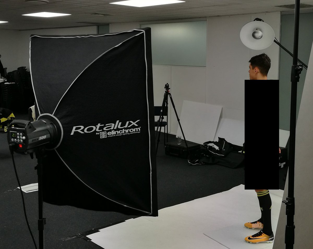
Looks like return of the big black box of doom but on a larger scale ...
I think CCM stole our kit look cos we're about to steal theirs.

I was actually hoping they might go with yellow socks just for something different with black shorts.
I was actually hoping they might go with yellow socks just for something different with black shorts.
Grumpy old bastard alert

I was actually hoping they might go with yellow socks just for something different with black shorts.
Black or white socks work well enough with black shorts.
Yellow shorts and we start to look like the current Australia team.
Some last minute speculation. The Fenerbache kit was speculated to being the new kit template

This kit looks great... but I dont think I'ts possible for this to be the new kit. Have a look at the size of the Adidas logo in the centre stripe. It doesnt have much room. Then Look at the kit preview

Theres a sizable gap between the adidas logo, and the edge of the stripe. I think this rules out the Fenerbache kit as they would not change the size of the Adidas logo, nor alter the size of the kit stripes. I think this will be the kit template

So this is my best guess.You might argue that the logo is too close to the stripes. But I put this down to the fact it was made on a computer and some may have made the logo a bit too big. Either that or it's because they modeled it as if it were someone was wearing it. So the pectoral muscle and the angle is changing the perspective of it. And the Fenerbache kit looks exactly the same in real life as it does there. Not a bad kit at all though just will be a bit disappointed though if it is because it's a teamwear kit from the 2015/16 range

Fuck this stupid game
I first saw that post in the app which squashed the images - actually the logo could be further out in the yellow stripe which isn't consistent with the preview either.
Fuck this stupid game
I first saw that post in the app which squashed the images - actually the logo could be further out in the yellow stripe which isn't consistent with the preview either.
Oh well. We don't know what crazy shark they've done til tomorrow. At this point though my guess stays the same
Wellington wouldn't go back to a standard Adidas template like the WeeNix currently have.
I'd say either it's a predominantly black kit, we've gone back to 4 black stripes on a yellow shirt, OR, we've swapped with the Mariners and now have their old stripey kit (which had 2 thick stripes/bars).
Probably not far off on the Fenerbahce I reckons. But maybe something more like this:

Adidas logo would have to be shifted to middle because no doubt A-League logo will be where it is on this at the moment.
Fuck this stupid game
Man I would be quite happy for a shirt like that.

From memory I think our kits came from the USA one other year (could be well wrong), but if so can imagine using MLS templates and Atlanta's is about the closest.
I will be more interested to see what the Away kit is like, looks like it's got more going on. Don't even want to guess but maybe my fake with windmills might actually be close. Just have to wait and see!
Yes! I'd buy that! (Get it? Because I buy every home kit design... Hah..)
From memory I think our kits came from the USA one other year (could be well wrong), but if so can imagine using MLS templates and Atlanta's is about the closest.
I will be more interested to see what the Away kit is like, looks like it's got more going on. Don't even want to guess but maybe my fake with windmills might actually be close. Just have to wait and see!
The 11/13 ones were most likened to Hull City, which was a standard template used around the world, if that's what you're thinking?
No I thought it was one of the more recent ones. But also I may have remembered wrong/made it up.
Supporter For Ever - Keep The Faith - Foundation Member - Never Lets FAX Get In The Way Of A Good Yarn
That's it Lads he is on the money
Supporter For Ever - Keep The Faith - Foundation Member - Never Lets FAX Get In The Way Of A Good Yarn

Supporter For Ever - Keep The Faith - Foundation Member - Never Lets FAX Get In The Way Of A Good Yarn

Supporter For Ever - Keep The Faith - Foundation Member - Never Lets FAX Get In The Way Of A Good Yarn
looks pretty nice! Still holding on for a return of the arm stripes, but this will do great.
Absolutely gorgeous... Yum yum.


