What does it mean? As a non Te Reo speaker.
"The second flight" I think
What does it mean? As a non Te Reo speaker.
"The second flight" I think
Translation of the Maori is “E Rere Te Keo. The Rising Call.”
References is around Te Keo, Maori legend about Taniwha who rose from Wgtn Harbour and turned into a bird


Thanks for the translation, Domey on TV3 after the current commercial break
I like the new logo - a lot better than I thought they would come up with
it looks young, fresh and eager to please!
... now can we train the logo to score goals?

I can live with the new Logo, Domey came across very well I thought. TV3 gave him a decent amount of TV time appeared fairly supportive. All in all, I suggest, this actually turned out to be a positive good experience for the club.

I really really like it. I was expecting to hate it as i'm turning into a curmudgenly old man who is afraid of change, but that looks really good.
It's great that instead of turning us into the NZ Phoenix, it has actually gone the other way and anchored it more firmly into Wellington through the motto.

 +4
+4
Dura " we will be as tenacious as a wellington southerly and as gracious as a view from Mt Victoria"
love it.

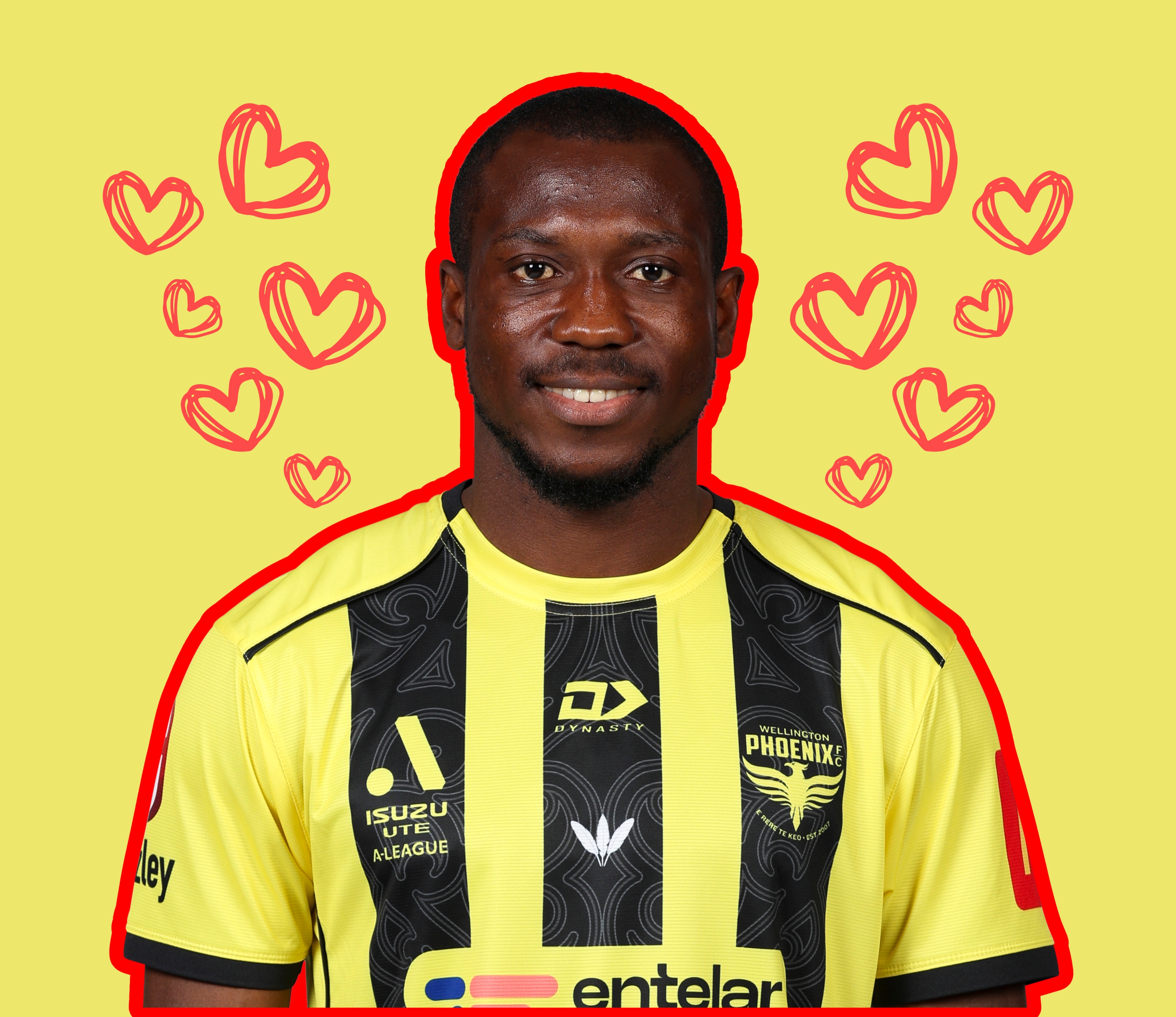
Domey said there is a striker coming. Our defence should look a lot more solid now. Yay!!
link to the interview anywhere?

Supporter For Ever - Keep The Faith - Foundation Member - Never Lets FAX Get In The Way Of A Good Yarn

 +2
+2

Supporter For Ever - Keep The Faith - Foundation Member - Never Lets FAX Get In The Way Of A Good Yarn

Interesting colour of the Sky there Blew. Almost on fire like a Phoenix rising??
That's the point of doing the unveiling during the golden hour.
I'm OK with logo. A bit more spacing between the elements would have done no harm.
I like this.
We needed to stimulate some interest, get a bit of a fresh feel to things to try and re-envigorate the fanbase.
I didn't realise before that something like this would give that feeling, but it does, and it seems to have been very well done. I like that we're pulling NZ's Maori history into the fold - the taniwha symbolism does tie in with the phoenix rising from the ashes thing really well. Nice touches with the dawn unveiling and the awesome sculpture thingy.
Exciting.
 +2
+2
Wouldn't be cool to see a large version of that coming out from the back of the Northern Stand at the Tin

And the great thing is, they did not go for "NZ Phoenix" as many feared. In fact, if anything, they have tied the nix into Wellington even tighter with the story of the taniwha in the Wellington harbour.
+2
Here is the full te Keo story. Worth a read. http://eng.mataurangamaori.tki.org.nz/Support-materials/Te-Reo-Maori/Maori-Myths-Legends-and-Contemporary-Stories/Ngake-and-Whataitai-the-taniwha-of-Wellington-harbour

'Lord grant me hair.'
"At the end of the drive the lawmen arrive...
I'll take my chance because luck is on my side or something...
Her name is Rio, she don't need to understand...
Oh Rio, Rio, hear them shout across the land..."
 +1
+1
Might be a cease and desist letter coming from Phoenix Beers : http://www.phoenixbeers.com.au/

Pretty cool - I like it.
Didn't make it to the dawn service but glad to come to work to this.
Not similar enough, different colours and fonts. Of course if businesses have Phoenix in the name the logos are going to lot a bit similar too
A Haka at the kick off at our first home game of the season? Any word on other games away from Wellington other than Auckland? With this big push this morning I am hoping we will spend more games here.
Hopefully this puts the anti-Nix brigade into more of a tizzy as usual!
Love the logo, just not 100% sold on the F/C part...
A Haka at the kick off at our first home game of the season? Any word on other games away from Wellington other than Auckland? With this big push this morning I am hoping we will spend more games here.
No. Just no.
Grumpy old bastard alert
Ahh vader, sometimes your signature is so fitting ;)

I was being phace...face...smart!
As for the FC. a good move. We are a club side in Wellington. Not a National side so Wellington Phoenix FC is great.
So I’m a fan, like the bird and the fonts. Like the Maori and the symbolism behind it. Like what I’ve seen of it on the Nix car and suits but What I don’t like is the FC with the line through it but I can live with that.
pleasantly surprised by this. Was certainly in the 'don't change the logo' camp pre the ceremony, but have swung the other way. Clean, Minimal and fresh. A new start in some respects.
Yea exactly how I feel too. just didn't think the logo should really be a priority, but now I'm loving it
I'm liking the look of the new phoenix on the car in that article