Wellington Phoenix Men

Phoenix kit - The return of the stripe

2564 replies · 540,055 views
about 5 years ago · edited about 5 years ago · History
WanderingSheep
Lachyloolaa
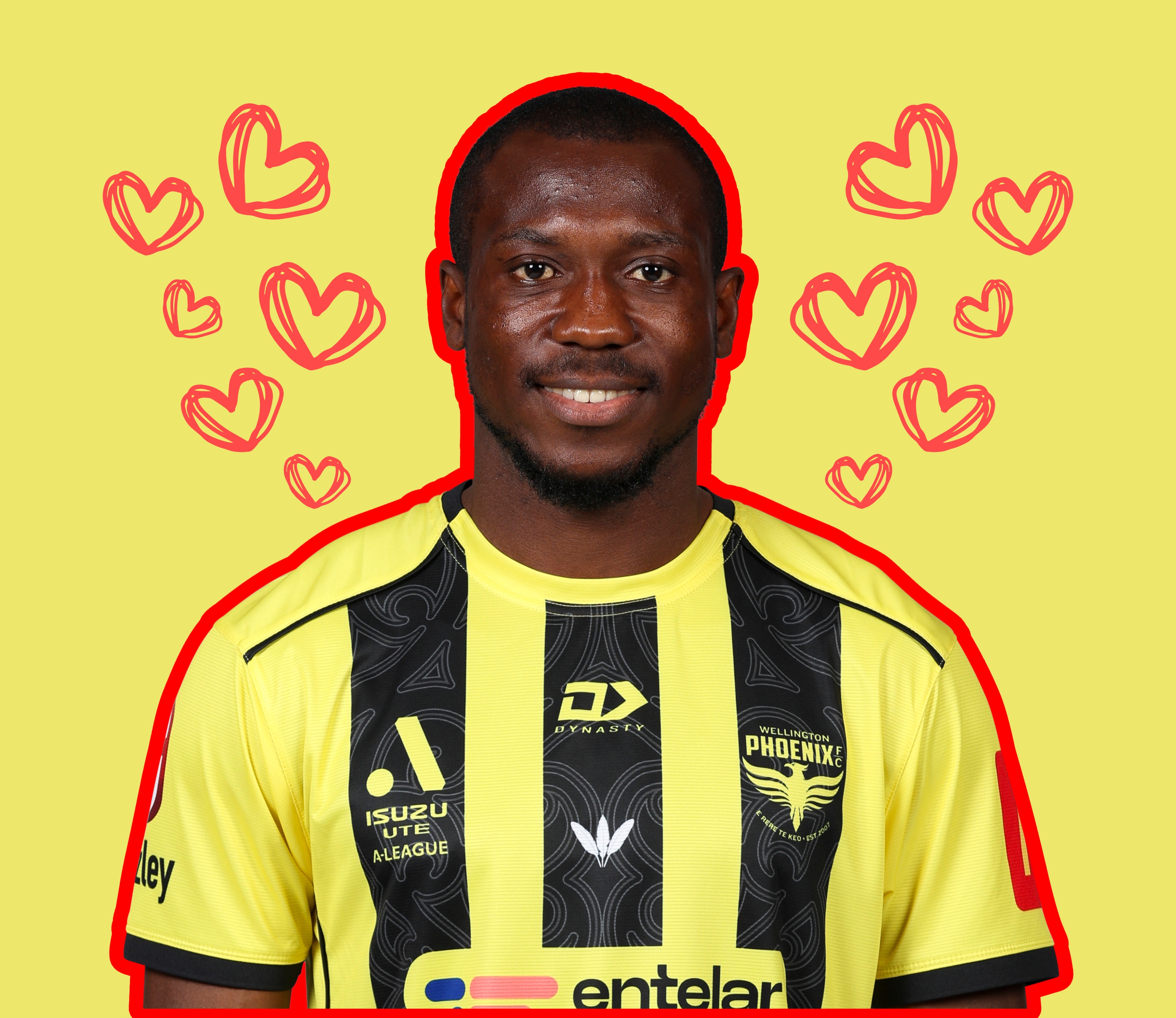
Away kit came today. Looks beautiful.

Undecided about which kit to get now, Red or the away. I love both but veering towards the away.

Last time I went into footy central they didnt have any in stock though. ROYS on lambton have them, but they're $100.
I was down there about 3 weeks ago and they had the away kit L for $90. Felt a little gutted considering I had to wait till March and had to pay more. (though tbf I didn't know when the kit would show up at the time). I'm torn on whether to get both kits honestly, cuz they're both class. Just wish the home kit had been up to the same standard.
Permalink Permalink
about 5 years ago
Last day to pre-order the 'gong Nix shirt.
Permalink Permalink
almost 5 years ago · edited almost 5 years ago · History
anyone know where to find wellington phoenix photo galleries from 2014 to 2016. just trying to work out if we played any matches during this time with no sponsor logo on the back of our shirts
Permalink Permalink
almost 5 years ago · edited almost 5 years ago · History
holeinone
anyone know where to find wellington phoenix photo galleries from 2014 to 2016. just trying to work out if we played any matches during this time with no sponsor logo on the back of our shirts
Ask  Photomac 

GET YOUR SHIRTS OFF FOR THE BOYS

Permalink Permalink
almost 5 years ago
How long were we meant to keep the red kit? Is the mcr sponsorship meaning we're wearing the red kit for longer than was originally intended? 
Permalink Permalink
almost 5 years ago · edited almost 5 years ago · History
Bit of chatter we might have done it as a throw back to the Glory/Wollongong NSL final in 2000 when glory lost on pens after leading 3-0.
More likely its either the sponsorship or our record being better in red. 
Permalink Permalink
almost 5 years ago · edited almost 5 years ago · History
2ndBest
Bit of chatter we might have done it as a throw back to the Glory/Wollongong NSL final in 2000 when glory lost on pens after leading 3-0.
More likely its either the sponsorship or our record being better in red. 

If so, I'm all for this sharkhousery.
I'd say it would be for sponsorship reasons until they heatpress over the already heatpressed KPMG on our yellow kit.
Adelaide's resident Nix supporter
Permalink Permalink
almost 5 years ago
2ndBest
Interesting. A quick google search shows studies that say wearing red gives you a competitive advantage. 
This study says you are more likely to get favourable decisions from the ref:
https://www.bbc.com/future/article/20120731-wear-red-to-win-gold
And possibly even some physiological benefits:
https://community.dur.ac.uk/red.advantage/index.html/wordpress/research/

The studies also try and link red to certain psychological traits, though not sure how those necessarily link to football - maybe some benefit in a lot of the sports studied such as fighting sports at the olympics.

Not sure how yellow does.
Permalink Permalink
almost 5 years ago
The skid mark kit has to be our worst ever. Oddly enough, the Teal and the Red look really nice kits. I'd be happy if we kept them both.
Proud to have attended the first 175 Consecutive "Home" Wellington Phoenix "A League" Games !!

The Ruf, The Ruf, The Ruf is on Fire!!

Permalink Permalink
over 4 years ago
Could that be a hint that it might be black? Surely not.
Permalink Permalink
over 4 years ago
Permalink Permalink
over 4 years ago
RR
 Pretty low bar when it comes to comparing it with last season's kit... Still, hoping for another banger away & third kits
Permalink Permalink
over 4 years ago
The skid mark top was crap but I'd rather the club kept the Jade & the Red kits as our 2nd & 3rd kits. I wouldn't change them for a few years. 
Proud to have attended the first 175 Consecutive "Home" Wellington Phoenix "A League" Games !!

The Ruf, The Ruf, The Ruf is on Fire!!

Permalink Permalink
over 4 years ago

This kit has been brought before by someone. Piney also posted an old photo of their black kit. I wonder if the Nix had a look at this. I would wanna keep the aqua kit though.
Permalink Permalink
over 4 years ago · edited over 4 years ago · History
If the home kit is black and/or stripey this season I will buy the shark out of it.
Adelaide's resident Nix supporter
Permalink Permalink
over 4 years ago · edited over 4 years ago · History
RR
Been shown a supposed leak of the Kits. [Spoilers]https://pbs.twimg.com/media/E_tdN8_UUAEw8Os?format=jpg&name=medium[/Spoilers]
Very much like the turquoise/teal one. I think the yellow/black one would be better if the black stripes were fully completed and had the sponsor over top but didn't break the lines. It almost feels to me as if someone has done an MS Paint job on it and having it break the stripes. Very much like last seasons strip...

Just my opinion of course. 
Permalink Permalink
over 4 years ago
I do like the away kit.
Permalink Permalink
over 4 years ago · edited over 4 years ago · History
Yeah I would have liked the Spark logo to be red, and the text a different colour - maybe white with a thin outline? Just something different to look at that breaks up the duopoly, a la Huawei (though that was a little garish for me). Still a really nice kit though, certainly up there.

Away kit is phenomenal, as per. Last season's away kit was probably my favourite Nix kit in history, so I'm keen to see how this one looks being worn
Permalink Permalink
over 4 years ago
I'm positive about the kits, but will wait to see the actual release to decide how good/great they are.
The thing I'm happiest about is having a major sponsor on board. That's massive for me. I was a bit worried having the various "low-key" sponsors last year and Domey's callout for the Woman's team sponsorship, that there were slim pickings. But really happy about Spark.
(assuming the leak is right and that it actually IS Spark, i find it odd that home and away have different sponsors?) 
I wonder if there is any link between Spark as a sponsor and upcoming TV rights?
Permalink Permalink
over 4 years ago
Sponsors - Fantastic
Away Kit - WOW
Home kit - Nice, but don't like the stripes cutting out halfway. Looks like a big + sign
Permalink Permalink
over 4 years ago
gimme gimme gimme

You know we belong together...

Permalink Permalink
over 4 years ago · edited over 4 years ago · History
Thanks, I hate it. Would be good if not for the big yellow bar across the belly.

Got me feeling rather... cross.

Away kit is good, but not as good as last year.

Valley FC til I die?

Permalink Permalink
over 4 years ago
billyspleen75
Sponsors - Fantastic
Away Kit - WOW
Home kit - Nice, but don't like the stripes cutting out halfway. Looks like a big + sign
The home kit looks like a cross with Spark nailed to it.
Like a chocoholic but for booze

Permalink Permalink
over 4 years ago
Meh, it's fine. 

a.haak

Permalink Permalink
over 4 years ago
Loved last seasons away kit and this one is just as good imo. Underwhelmed by the home kit and agree that it's a shame they didn't carry the bars through. Still, an improvement on last year.
Permalink Permalink
over 4 years ago
It's a bit harder to carry the stripes through when it's yellow and black. Can't use white or black for the sponsor. any other colour looks silly and you have to do a white trim. Remember the days with the Huawei logo?
vkFkurInhvX3vJX.jpg 115.89 KB
Permalink Permalink
over 4 years ago
Will there be a red Wellygong Wolves version this season?
Permalink Permalink
over 4 years ago
Home kit looks a lot better with shorts & socks in shot

Valley FC til I die?

Permalink Permalink
over 4 years ago
Think that home strip would have worked better with black shorts.
Permalink Permalink
over 4 years ago
WanderingSheep
Loved last seasons away kit and this one is just as good imo. Underwhelmed by the home kit and agree that it's a shame they didn't carry the bars through. Still, an improvement on last year.
strip rev.jpg 1.66 MB
Permalink Permalink
over 4 years ago
El Simmo
WanderingSheep
Loved last seasons away kit and this one is just as good imo. Underwhelmed by the home kit and agree that it's a shame they didn't carry the bars through. Still, an improvement on last year.
strip rev.jpg 1.66 MB

That's actually not bad, but I just don't think that away strip works with the yellow as much as it  does with the turquoise/teal set up.
Permalink Permalink
over 4 years ago
Obviously the away kit is fantastic, and probably the best kit in the league, but I really like the 'crossy'.
Permalink Permalink