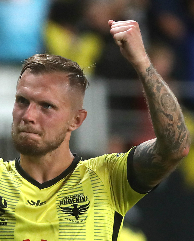
Will still get to support the club but can't say I'm impressed. From the stands it'll just look like a blob of yellow, just not that interesting as some of the other kits from the league this season
Will still get to support the club but can't say I'm impressed. From the stands it'll just look like a blob of yellow, just not that interesting as some of the other kits from the league this season
Permalink
Permalink
I don't know - I quite like it. I appreciate the subtlety although it does look as if the pinstripes and sleeve pattern were always meant to be bolder and they ran out of ink... On TV it will just look plain yellow.
Is it a slightly darker/warmer shade of yellow to last year? Or is that just my monitor?
Is it a slightly darker/warmer shade of yellow to last year? Or is that just my monitor?
Permalink
Permalink
Endorsed by
Will still get to support the club but can't say I'm impressed. From the stands it'll just look like a blob of yellow, just not that interesting as some of the other kits from the league this season
Any phoenix kit would be better than a knock off of a miramar afc or Atalanta c2015 shirt.
Bit of a dick move to jump onto our forum to slag of our kit!
When your club is a real club, with real fans with a real forum and played a real league game then maybe you can have a space to be all anti nix!
Queenslander 3x a year.
Permalink
Permalink
Endorsed by
Will still get to support the club but can't say I'm impressed. From the stands it'll just look like a blob of yellow, just not that interesting as some of the other kits from the league this season
GET YOUR SHIRTS OFF FOR THE BOYS
Permalink
Permalink
Endorsed by
I don't know - I quite like it. I appreciate the subtlety although it does look as if the pinstripes and sleeve pattern were always meant to be bolder and they ran out of ink... On TV it will just look plain yellow.
Is it a slightly darker/warmer shade of yellow to last year? Or is that just my monitor?
Is it a slightly darker/warmer shade of yellow to last year? Or is that just my monitor?
GET YOUR SHIRTS OFF FOR THE BOYS
Permalink
Permalink
Endorsed by

Ruffled a few feathers have I? It’s just a fact - is the kit the same colour as the seats? Yes or no?
Bit precious!
Bit precious!
Permalink
Permalink
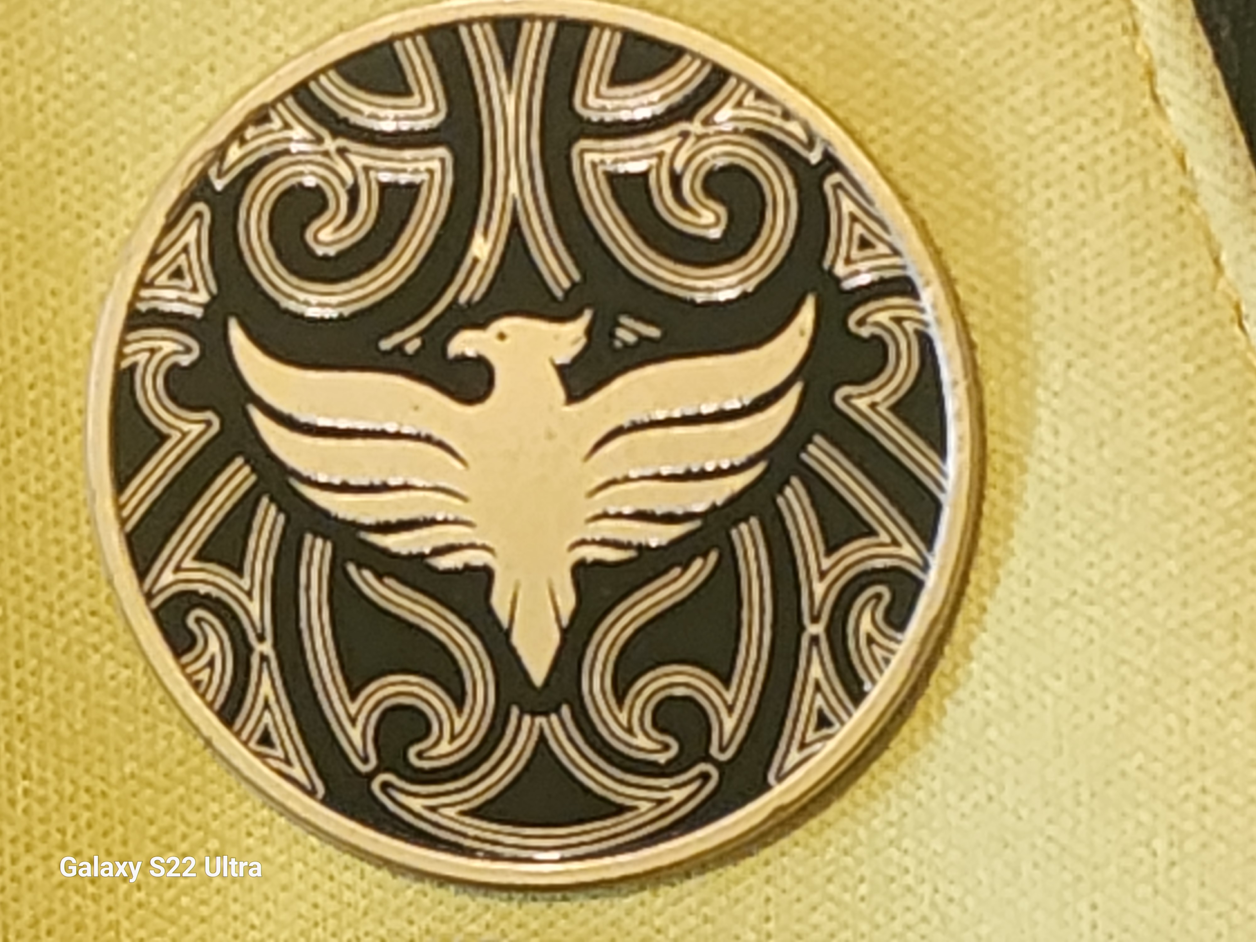
If the pinstripes were darker, the whole kit would pop. I assumed the Oppo logo being black meant they went lighter but I have had it mentioned to me that it was originally intended to be darker but didn't come out that way (I cannot verify the validity of that however).
Permalink
Permalink
Endorsed by


Ruffled a few feathers have I? It’s just a fact - is the kit the same colour as the seats? Yes or no?
Bit precious!
Bit precious!
GET YOUR SHIRTS OFF FOR THE BOYS
Permalink
Permalink

Ruffled a few feathers have I? It’s just a fact - is the kit the same colour as the seats? Yes or no?
Bit precious!
Bit precious!
GET YOUR SHIRTS OFF FOR THE BOYS
Permalink
Permalink
Endorsed by
If the pinstripes were darker, the whole kit would pop. I assumed the Oppo logo being black meant they went lighter but I have had it mentioned to me that it was originally intended to be darker but didn't come out that way (I cannot verify the validity of that however).
GET YOUR SHIRTS OFF FOR THE BOYS
Permalink
Permalink
Endorsed by


Much prefer this one, especially the collar and sleeves.
However, I think our new kit is smart and clean. I like it, definitely one of the better ones we got from Paladin
Permalink
Permalink
Endorsed by


Just shows you how opinions differ for me its one of the worst our colors are Yellow and Black not yellow and even more yellow. Could have been much better but seems what people were shown and whats actually been delivered are different
GET YOUR SHIRTS OFF FOR THE BOYS
Permalink
Permalink
Endorsed by

Ruffled a few feathers have I? It’s just a fact - is the kit the same colour as the seats? Yes or no?
Bit precious!
Bit precious!
No you're just really bad at banter.
You sound like you're doing far too much.
Permalink
Permalink
Endorsed by

If the pinstripes were darker, the whole kit would pop. I assumed the Oppo logo being black meant they went lighter but I have had it mentioned to me that it was originally intended to be darker but didn't come out that way (I cannot verify the validity of that however).
Not sure if it is a Paladin issue but I find it quite puzzling that this kind of thing isn't picked up on before going into production.
From my (admittedly limited) exposure to garment manufacturing, you always get a sample to approve before going ahead. Surely they don't just go off the 3D mockup and hope for the best, right...?
Permalink
Permalink
If the pinstripes were darker, the whole kit would pop. I assumed the Oppo logo being black meant they went lighter but I have had it mentioned to me that it was originally intended to be darker but didn't come out that way (I cannot verify the validity of that however).
Not sure if it is a Paladin issue but I find it quite puzzling that this kind of thing isn't picked up on before going into production.
From my (admittedly limited) exposure to garment manufacturing, you always get a sample to approve before going ahead. Surely they don't just go off the 3D mockup and hope for the best, right...?
GET YOUR SHIRTS OFF FOR THE BOYS
Permalink
Permalink

Its a very plain design, but better than last years, and thankfully we wont get to see the terrible dark kit at home.
But I cant say I really like it, I will continue to wear my yellow and black stripey with SONY on it, its heaps better.
But I cant say I really like it, I will continue to wear my yellow and black stripey with SONY on it, its heaps better.
Permalink
Permalink
Endorsed by


Will be interesting to see what the away kit looks like.
Queenslander 3x a year.
Permalink
Permalink
Endorsed by

A-Leagues just leaked our kit that was meant to be released later this week pic.twitter.com/gZI8xcC7pR
— Butter Butter (@BarbarousesLove) September 30, 2024
The Wanderers goalkeeper kit pulls off our kit better than our actual kit does.
Adelaide's resident Nix supporter
Permalink
Permalink
Will still get to support the club but can't say I'm impressed. From the stands it'll just look like a blob of yellow, just not that interesting as some of the other kits from the league this season
Any phoenix kit would be better than a knock off of a miramar afc or Atalanta c2015 shirt.
Bit of a dick move to jump onto our forum to slag of our kit!
When your club is a real club, with real fans with a real forum and played a real league game then maybe you can have a space to be all anti nix!
Permalink
Permalink
Endorsed by


 +1
+1
+1
Ruffled a few feathers have I? It’s just a fact - is the kit the same colour as the seats? Yes or no?
Bit precious!
Bit precious!
Also stop stinking up this fantastic forum because you don't like your conspiracy theory rife Facebook forum
Permalink
Permalink
Endorsed by
I wanted to wait till I could see the kit properly before passing judgement, though yellow shorts had already pissed me off. If the home kit had been like Half a Pint's pinstripe design I would've been happy...
This is bar none the most lazy sharkty kit we have ever produced. The render does it far more justice than the actual kit. Those pinstripes and koru pattern are fudgeing invisible, what's the point of even having them on the kit? They can't be seen from a distance and can barely be seen up close.
Stripes have been our thing since 2009 why the fudge aren't we leaning into it? There are so many blatantly better ideas from other users on here than what we've been served up, hell there are far better striped kits in the league itself. I'd go as far as to say our kit is easily the worst in the league (Except for Aucklands)
Definitely not buying this shark 0/10

Permalink
Permalink
Endorsed by

I would actually say a stripey has been our thing since day one its on the original badge. My understanding is it was wanted as our first kit but it wasnt an option with the kit supplier.
Has seemed that Welnix has been trying over time to disassociate us from anything to do with our beginnings. The stripey has become something less and less obvious over the years. Very disappointed with some of the recent efforts to down play the stripey.
With this seasons being in my eyes the worst by far. From a distance it looks plain yellow and dont go with some of the excuses being handed down for it.
GET YOUR SHIRTS OFF FOR THE BOYS
Permalink
Permalink
Endorsed by
Move over All Whites, the All Yellows are in town.
Permalink
Permalink
Endorsed by
.png)
If my team produced a shirt where the badge couldn't be seen, I wouldn't go around trying to troll other clubs' supporters.
Will still get to support the club but can't say I'm impressed. From the stands it'll just look like a blob of yellow, just not that interesting as some of the other kits from the league this season
At least he’s keeping his level of banter in line with the quality of the club he supports. I saw today that Auckland appears to have redesigned their logo entirely according to Google and I must say it’s a drastic improvement

Permalink
Permalink
Tbh I don't think I would've been as disappointed if they hadn't taken so long. Just feels kinda anti-climactic after such a long wait
Permalink
Permalink
Endorsed by


Permalink
Permalink
A blank badge is better than a pheasant sticker son
Of course, better to be bland and no personality. Gotcha.
Permalink
Permalink
A blank badge is better than a pheasant sticker son
Of course, better to be bland and no personality. Gotcha.
Bland, no personality - apt description of the city the 'club' represents.
Queenslander 3x a year.
Permalink
Permalink
Endorsed by