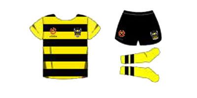
Normo's coming home
We need to make sure we see the yellow. We don't want to look like the marinara.
If stripes are the way to go, then I'm all for it.

Apparently I'm apathetic, but I couldn't care less.
"Being a Partick Thistle fan sets you apart. It means youre a free thinker. It also means your team has no money." Tim Luckhurst, The Independent, 4th December 2003
All I do is make the stuff I would've liked
Reference things I wanna watch, reference girls I wanna bite
Now I'm firefly like a burning kite
And yousa fake fuck like a fleshlight
Apparently I'm apathetic, but I couldn't care less.
"Being a Partick Thistle fan sets you apart. It means youre a free thinker. It also means your team has no money." Tim Luckhurst, The Independent, 4th December 2003

Stripes for 09/10!

Oi Oi Edgecumbe... lets have a clean sheet
hoops? nah too much like Taranaki
Stripes I think would look good, but would prefer black for the sleeves
(except when they're sleevless and they = AFL lol)
Im with you on that

If they can't figure it out for themselves, they are really, really stupid...
I'm not a fan of black/yellow stripes. Though I can't say for real until I see an actual shirt (not mock-ups). And I play for Miramar, so stripes are what I wear (black/blue). Black and Yellow just make yuck in my head.

Its Better with the sony and sponsors
Because Black is slimming.
how many do you own?
Im with you on that

That makes me think of bees far more than the horizontal stripes.

Its Better with the sony and sponsors
Apparently I'm apathetic, but I couldn't care less.
"Being a Partick Thistle fan sets you apart. It means youre a free thinker. It also means your team has no money." Tim Luckhurst, The Independent, 4th December 2003
So yes, a splash of yellow would be good. I was looking through my Subutteo Team wall chart, and how about
a) Peru style diagonal yellow stripe
b) West Ham away double yellow hoops
c) or concentric circles - which will really screw opponents ability to keep the eye on the ball
Honey... sauce... it's all too bluddy much


Fixed

If only.... I like the stripes too
However I think the first mockup is good. That horizotal one is awful.
Queenslander 3x a year.
Founder


VUW AFC - Victoria University Football for life
What I DON'T like is how all the teams have to conform in the A-League. It really leave no room to the imagination. Same format shirts (including GK strip), same format scarves, and I suspect same gadgets too.
By the way I think it's disgraceful that fully professional team are told what brands, style of tops and merchandise they should use.
VUW AFC - Victoria University Football for life
