Wellington Phoenix Men

Why I like stripes (stripping 2009)

1016 replies · 14,150 views
about 17 years ago · edited over 13 years ago
No offence to anyone else, but the only jersey i would buy would be the one that I posted.

I think its the most likely design if they were to go for stripes
Permalink Permalink
about 17 years ago · edited over 13 years ago
Stripes are bloody ugly. At least Bullions has less of them, but if there were none it would be better
Permalink Permalink
about 17 years ago · edited over 13 years ago
Some people hate em, some people love em. but majority of people like em.

You got anything better than stripes then mate?
nkcroatia_nz2009-01-31 18:58:35
Permalink Permalink
about 17 years ago · edited over 13 years ago
Stripes are only ugly if done wrong (e.g. Hull City)

a.haak

Permalink Permalink
about 17 years ago · edited over 13 years ago
Hard News wrote:
Doesn't make any difference if he has.  Stripes are a done deal.

I bloody well hope so.
Permalink Permalink
about 17 years ago · edited over 13 years ago
Bah. Ugly IMO. 
Permalink Permalink
about 17 years ago · edited over 13 years ago
That is f**king terrible. Even worse than the kits this year.

a.haak

Permalink Permalink
about 17 years ago · edited over 13 years ago
a new low for reebok, I am not holding out much hope for the new nix kit now either.
Permalink Permalink
about 17 years ago · edited over 13 years ago
im feeling pretty worried about what our shirt will look like cause that looks crap
Permalink Permalink
about 17 years ago · edited over 13 years ago
the alternate stip isn't too bad, their 1st strip looks ok, I reckon its beetr than the current one TBH

Queenslander 3x a year.

Permalink Permalink
about 17 years ago · edited over 13 years ago
The badge is in the middle for gods sake

a.haak

Permalink Permalink
about 17 years ago · edited over 13 years ago
ok so that's bad, but the rest looks ok.

Queenslander 3x a year.

Permalink Permalink
about 17 years ago · edited over 13 years ago
could have been designed by a child. not very elaborate.
the badge looks too close too the number on the front. At first I thought it looked ok but the more I look the worse it looks.

wonder what the back will be? just the dark blue i assume


Permalink Permalink
about 17 years ago · edited over 13 years ago
I hate to think what the Nix one will look like now. All these prototype Nike and Adidas designs had me excited and I almost forgot it was going to be another Reebok design travesty. 

Permalink Permalink
about 17 years ago · edited over 13 years ago
Hard News wrote:
Allegedly our one is significantly sexier than the Mariners one.


Thank God for that
Permalink Permalink
about 17 years ago · edited over 13 years ago
I must admit I like the predominately navy one. The white shorts do nothing for me.
Permalink Permalink
about 17 years ago · edited over 13 years ago
I have to say... I'm in love with those two shirts from the CCM

ive got a song that wont take long, Adelaide are rubbish.. the second verse is same as the first.. ADELAIDE ARE RUBBISH

Permalink Permalink
about 17 years ago · edited over 13 years ago
They are terrible, although hard to tell just how bad from that angle
You know we belong together...

Permalink Permalink
about 17 years ago · edited over 13 years ago
HAHAHAHAHAH what a ming job!

that is...haha i dont even have words, no offence to ccm they tried their best but thats crap.

Melbourne and Adelaide's ACL kits looked sharp
Permalink Permalink
about 17 years ago · edited over 13 years ago
Its agreed with the Marinators that the picture makes the shirts look horrible, Apparently they look a lot better in real life. And they probably wont look too bad with the sponsors plastered all over them.
I dont think they are too bad myself.
Permalink Permalink
about 17 years ago · edited over 13 years ago
Heard more reports that our strip is the one everyone is hot for at A-League clubs and Reebok.

How's my driving? - Whine here

Permalink Permalink
about 17 years ago · edited over 13 years ago
Hard News wrote:
Heard more reports that our strip is the one everyone is hot for at A-League clubs and Reebok.


from a reliable source?
Permalink Permalink
about 17 years ago · edited over 13 years ago
Hard News wrote:
Heard more reports that our strip is the one everyone is hot for at A-League clubs and Reebok.


Yeah??  Bet they tell all the forums that !! 

hepatitis2009-02-03 20:43:05
Permalink Permalink
about 17 years ago · edited over 13 years ago
Hard News wrote:
Reliable sources...


As usual.
Permalink Permalink
about 17 years ago · edited over 13 years ago
 So when is the new Nix kit due to be confirmed as official?
Permalink Permalink
about 17 years ago · edited over 13 years ago
When they sell out of the old ones.

Should see Newcastle's soon ready for the ACL (not that they have any players to wear it) and then the other clubs not until the season finishes I imagine.

How's my driving? - Whine here

Permalink Permalink
about 17 years ago · edited over 13 years ago
Can't wait to see it!

Hopefully better than CCM's though tbh anything would be better than the current. Unless it's Bolton-esque.

a.haak

Permalink Permalink
about 17 years ago · edited over 13 years ago
Hard News wrote:
When they sell out of the old ones.

Should see Newcastle's soon ready for the ACL (not that they have any players to wear it) and then the other clubs not until the season finishes I imagine.
Maybe I'll finally get around to investing in an away shirt then
You know we belong together...

Permalink Permalink
about 17 years ago · edited over 13 years ago
http://au.fourfourtwo.com/news/95534,aleagues-new-strips-revolution.aspx


EXCLUSIVE: Season five of the A-League will see a dramatic facelift for the ten teams with the FFA giving the go-ahead for many clubs to come up with their own new designs.

According 
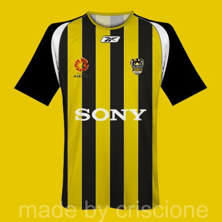
to sources, the Mariners' new striped look is just the tip of the iceberg for a league that, thus far, has stuck to a traditional unified look across the board.

And the changes to the kits have been driven by feedback from the clubs.

For instance, Adelaide's Reds shirt will feature a red jersey with a subtle white "knitted" effect - but their new away kit will shock and delight fans by abandoning the enforced white for an all-BLACK strip.

Perth Glory will see stripes - believed to be alternating light and dark purple - on their front but plain on the back.

Sydney FC will opt for a "cleaner" look with their sky blue shirts. Like the Mariners' new away top, Sydney's home strip is expected to be mainly light blue with only some thin dark blue detailing and just a hint of orange.

And Wellington Phoenix will also go for stripes in a look similar to Hull City in the EPL, with multiple thin stripes compared to the Mariners' new look broad stripe.

Newcomers North Queensland Fury's kit will be green - but definitely NOT the green and white hoops of Fury manager Ian Ferguson's former Glasgow rivals Celtic from his time as a Rangers star.

The A-League kit sponsor is Reebok who are expected to unveil the new-look kits later in the year.

How's my driving? - Whine here

Permalink Permalink
about 17 years ago · edited over 13 years ago
Permalink Permalink
about 17 years ago · edited over 13 years ago
HAHAHAHAHAHA this one it is then! oh im so happy sorry "pault" your b'ham hating on hull city didnt work. and its not even orange its yellow!
Oh im so happy, im def going to buy one now!
nkcroatia_nz2009-02-04 12:28:57
Permalink Permalink
about 17 years ago · edited over 13 years ago
yeah should be good. if thats how theyre describing it. Id def bye one. Im sorry to all you strip haters out there but I ersonally LOVE THEM!
Permalink Permalink
about 17 years ago · edited over 13 years ago
Don't like the Hull City stripes that much tbh

a.haak

Permalink Permalink
about 17 years ago · edited over 13 years ago
Excellent!
Permalink Permalink