Auckland Pride - Make Auckland Great Again

7158 replies · 1,193,326 views
about 2 years ago
RR
mrsmiis
YoungHeartHM
mrsmiis
 https://x.com/TheRealALM/status/1768081701857804345?s=20 
Actually doesn't look too bad to be honest.
Right? Bit of flak on Twitter with people calling it a FIFA create-a-club badge (which... fair) but it's simple and smooth. Colour-wise, it's exactly what we wanted.

Now, the mystery's figuring out what the AFC means - just a plain Auckland FC is the best case
As Christo pointed out on Twitter,  it's a shield, Knight's helmet grill, volcano mash up. The logo looks better once I had that pointed out, I just hate the blue on black.
 
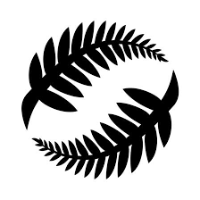
Big fan of the symbolism - but a little bit of shadowing, bevel or outlining would have done wonders. Looks too generic otherwise, in spite of the meaning behind the design
Permalink Permalink
Endorsed by
InsulinMachineWhoStoleMySock
about 2 years ago
What a horrendous kit 
Permalink Permalink
Endorsed by
Marto
about 2 years ago · edited about 2 years ago · History
The kit looks good imo. It's fairly traditional footbal kit but modern at the same time, like the logo. The whole thing has Inter Milan vibes which is a good thing. 

I'd be pretty happy with this if I lived in Auckland I'd certainly buy into that. 

I feared the worst, like a knights helmet bitmap creation, in grey/black

People will have their opinions but I think they did well. What matters is they sell it to the public and build a fan culture
Permalink Permalink
Endorsed by
billyspleen75Gooner 4 Life
about 2 years ago
Not a graphic designer by any means but I reckon I did better

IMG_6419.png 522.23 KB
Permalink Permalink
Endorsed by
MartoWanderingSheepwi
about 2 years ago
I'm quietly happy. They're gonna work their cringey name in but ultimately have called it something sensible.
Permalink Permalink
Endorsed by
billyspleen75Buffon IIcoochieedunnix+4
about 2 years ago
This is a better pic.
image.png 523.86 KB
Permalink Permalink
Endorsed by
billyspleen75coochieeInsulinMachineKiwiMancunian+2
about 2 years ago
Ranix
This is a better pic.
image.png 523.86 KB

Yeah but the pic from Mike Burgess is an actual kit, surely that is exactly what it will look like?
Permalink Permalink
Endorsed by
MartoWanderingSheepWhoStoleMySock
about 2 years ago
Bit of a lame name... 

Why not Tāmaki Makaurau FC. 

I like their shirts! 
Permalink Permalink
about 2 years ago · edited about 2 years ago · History
I think the name is fine. Has Auckland in there, nice and conservative football name and goes nicely with AFC. 

The logo is fine as well and if a nickname is wanted to be given by the owner who is coughing up the coin, that’s ok.

Can however see the name morphing into AFC Black Knights unless we are careful .  Maybe that’s the end game

It’s just the kit, which sucks blue and black. Needed to be blue and white hoops but I guess the black in black knights spoils the thing


Auckland will rise once more

Permalink Permalink
about 2 years ago
Really good name.

Decent kit.

Sharke logo.

Three for me, and two for them.

Permalink Permalink
Endorsed by
Gooner 4 LifeLGWhoStoleMySock
about 2 years ago
Auckland FC is probably the least offensive name, and noone can argue with it. The kit looks like Miramar Rangers but so be it. Watching the intro vid on stuff theres a couple of knights referencesm with an armoured foot trapping the ball a few times. I hope the fans can get in behind it and we have a decent rivalry.

Queenslander 3x a year.

Permalink Permalink
about 2 years ago
Not bad on either front to be honest. Something not quite right visually with a blue on black design for the strip, but they'll work that all out over the coming years. Logo looks better than I thought it would, but I'm not sold on it 100% - In saying that, it's not my team, so yeah, hard to relay fully how I feel I guess.

Best part of the day for me was when they changed their IG handles around, changed them back, and then had someone steal their preferred handle and now they're aucklandfc_24 rather than aucklandfc24. 

Perfection. Peak A-League, call it what you will. 😂
Permalink Permalink
Endorsed by
loProcrastinixingSamCoughlanWanderingSheep+1
about 2 years ago
Friar Tuck
Not a graphic designer by any means but I reckon I did better

IMG_6419.png 522.23 KB
Your shirt is better but that always changes every year anyway.

Their logo is more modern, it's the way it's going these days. I like it
Permalink Permalink
Endorsed by
Friar Tuck
about 2 years ago
'Auckland FC' is the definition of a placeholder name.
Glad that anything knight-related isn't anywhere near it.
I feel like AFC Auckland would've been the best option, so naturally it didn't even make the shortlist.

Now they need to work the hell out of their website's SEO to make sure that they appear above Auckland City FC in any casual punter's searches for A-League tickets...
Permalink Permalink
Endorsed by
coochieelotheprof
about 2 years ago
Elemenop
Bit of a lame name... 

Why not Tāmaki Makaurau FC. 

I like their shirts! 
Because, as I keep saying, every time someone suggested Te Reo in the name, the kind of people who really like David Seymour started yelling about WOKE

Ramming liberal dribble down your throat since 2009
This forum needs less angst and more Kate Bush threads


Permalink Permalink
Endorsed by
theprofWanderingSheep
about 2 years ago
Elemenop
Bit of a lame name... 

Why not Tāmaki Makaurau FC. 

I like their shirts! 

Just go to Auckland24 Supporters Facebook page for an answer.

I would have preferred AFC Auckland, as I think is something different for NZ and a link to Bournemouth. FC I think of the Smurfs. But otherwise smart & safe naming.

Permalink Permalink
about 2 years ago · edited about 2 years ago · History
Faaarrrrk. Despite what I think about the kit itself, a gold sponsor looks absolutely majestic. As gold’s already an accent on the badge, I hope the club takes this direction because phew

Credit to @mikeymifsud on Twitter

E9EAFDFB-A71E-4DBF-957F-A216BFED4882.jpeg 294.11 KB
Permalink Permalink
Endorsed by
billyspleen75DolorasInsulinMachinest+1
about 2 years ago · edited about 2 years ago · History
Hands off Whittakers tho! Auckland has enough businesses up there

But yeah, a gold coloured sponsor logo does make the design pop more.
Permalink Permalink
Endorsed by
stWanderingSheep
about 2 years ago
The name is OK, classic simple.
The Logo is shark, blue and black is to close together, to many lines to busy, can't see what is going on.
Permalink Permalink
Endorsed by
Marto
about 2 years ago
Sydney FC vs Auckland FC: battle of the big cities that people think are capital cities, but actually aren't.

A fierce derby in the making
Permalink Permalink
Endorsed by
FonewzealandpowerProcrastinixingst+1
about 2 years ago
You got the colour scheme 100% and the kit pretty much too (I think your Nike option looks better)
Friar Tuck
Not a graphic designer by any means but I reckon I did better

IMG_6419.png 522.23 KB
Permalink Permalink
Endorsed by
Friar Tuck
about 2 years ago
YoungHeartHM
Christo
I still think the stripes are just stripes on a shield, but could they be lines on a grill?
images.jpg 8.77 KB

You son of a bitch, I'm seeing it now. 😂

The curve on the pic below definitely makes it look more like a grill.
Screenshot_2024-03-14-12-58-41-87_1c337646f29875672b5a61192b9010f9.jpg 138.72 KB
Turns out it was both lines on a shield and lines on a face grill!

It is definitely a minimalist & modern crest. Not sure it works well on the shirt badge as is (tweek the blue or something) but is fine on screen.
Permalink Permalink
Endorsed by
Friar TuckYoungHeartHM
about 2 years ago
Looks better here though.
GImV09RbwAA4vpC.jpg 435.86 KB
Permalink Permalink
Endorsed by
20 Legendbillyspleen75Buffon IIcoochiee+7
about 2 years ago
The blue looks way better in that photo
Permalink Permalink
Endorsed by
WhoStoleMySock
about 2 years ago
Wonder if the Phoenix can get a tap at the Chamberlain for whoever their beer sponsor is that season! That would be a gesture- 433 or Fortune’s Favours or Export 33 or whichever is flowing. 

I’m going to have to try harder to find something to dislike about Mr. Foley because he seems to be an excellent representative for his companies and for his home country too. Even buttering us up with the 2nd home country line. 

Well- the Phoenix have a better name, better colours and a longer history, but it feels good to have a bigger football family in NZ, even if it means letting McFlynn and Corica in…

Still who’s Rob in their crew? Rob’s our guy! 


Permalink Permalink
about 2 years ago
I think as a Hamiltonian I'm gonna stay a nix fan. The vibe I'm getting is that Auckland FC will be very Auckland centric and the nix will probably aim for the rest of the country. I can't wait to sit in the away bay at mt smart.

Auckland will be my second team though as Auckland > Australia still. Until they do something sharkty.
Permalink Permalink
Endorsed by
DolorasmrsmiisProcrastinixingst+1
about 2 years ago
They are hell bent on getting the Black Knights name used though aren’t they? Foley mentioned it a couple of times in the presser. I don’t think the fans will get behind the name at all but Foley will keep throwing money at it to gain traction. Still an element of naïveté with them and football though. The presser also raves on about the football heritage (or similar) of the name…. Really? This is not a new code in this country, we have followed FC clubs forever as did our fathers and grandfathers they are not dealing with a new football market here
Permalink Permalink
Endorsed by
st
about 2 years ago · edited about 2 years ago · History
Napier Phoenix
They are hell bent on getting the Black Knights name used though aren’t they? Foley mentioned it a couple of times in the presser. I don’t think the fans will get behind the name at all but Foley will keep throwing money at it to gain traction. Still an element of naïveté with them and football though. The presser also raves on about the football heritage (or similar) of the name…. Really? This is not a new code in this country, we have followed FC clubs forever as did our fathers and grandfathers they are not dealing with a new football market here
There is a launch video floating around on their socials and Black Knights text is present as well as an armored foot with football. I can imagine someone riding in on horseback for game one a la Crusaders
Permalink Permalink
about 2 years ago · edited about 2 years ago · History
Talking about the warrior class was an interesting thing…sounds like a bit of romanticism there. And no links to patu or taiaha either! Nor Maori Battalion…

But like it or not our nation has one of  its moments of being at Gallipoli and in the trenches in the rain in France during WWI. 

But that’s not a defenders against evil story.

Perhaps Nancy Wake? Surely she’s the closest we’ve got to Batman/Black Knights? Or Kiwis in the Battle of Britain?

Our military history has a lot of interesting and heroic stories, but not a lot of us v evil…


Permalink Permalink
about 2 years ago
martinb
Talking about the warrior class was an interesting thing…sounds like a bit of romanticism there. And no links to patu or taiaha either! Nor Maori Battalion…

But like it or not our nation has one of  its moments of being at Gallipoli and in the trenches in the rain in France during WWI. 

But that’s not a defenders against evil story.

Perhaps Nancy Wake? Surely she’s the closest we’ve got to Batman/Black Knights? Or Kiwis in the Battle of Britain?

Our military history has a lot of interesting and heroic stories, but not a lot of us v evil…

Don't think White Mice cut it.
Permalink Permalink
about 2 years ago · edited about 2 years ago · History
The story of Nancy Wake (White Mouse) is a fascinating yarn. I'd throw Charles Upham in there. 

Haven't seen the Foley presser, but I generally find any comparisons between war & sports a bit cringe. I'll concede less cringe for the more contact sports. The AFL & NRL generally do a good job with ANZAC Day weekend, and any commemorations they bring in.
Permalink Permalink
Endorsed by
martinb
about 2 years ago
Bet they wished they had a major sponsor to announce as well......
Permalink Permalink
Endorsed by
dunnix
about 2 years ago · edited about 2 years ago · History
RR
mrsmiis
YoungHeartHM
mrsmiis
 https://x.com/TheRealALM/status/1768081701857804345?s=20 
Actually doesn't look too bad to be honest.
Right? Bit of flak on Twitter with people calling it a FIFA create-a-club badge (which... fair) but it's simple and smooth. Colour-wise, it's exactly what we wanted.

Now, the mystery's figuring out what the AFC means - just a plain Auckland FC is the best case
As Christo pointed out on Twitter,  it's a shield, Knight's helmet grill, volcano mash up. The logo looks better once I had that pointed out, I just hate the blue on black.

Still not good when trying to make it contrast in small applications though.

I must say the blue in the kit Corica's holding looks better though.
Adelaide's resident Nix supporter
Permalink Permalink
about 2 years ago
Rusty Dunks
Bet they wished they had a major sponsor to announce as well......

Foley will get that name on the jersey by hook or by crook!
featured.png 494.07 KB
Permalink Permalink
Endorsed by
InsulinMachineLGlomrsmiis+3
about 2 years ago
coochiee
The story of Nancy Wake (White Mouse) is a fascinating yarn. I'd throw Charles Upham in there. 

Haven't seen the Foley presser, but I generally find any comparisons between war & sports a bit cringe. I'll concede less cringe for the more contact sports. The AFL & NRL generally do a good job with ANZAC Day weekend, and any commemorations they bring in.

It comes across as a kind of personal …well more than philosophy, so on that basis I feel less cringe about it. It seems to be something he values very highly in looking at his life and the attitude of his organisations. 

But connecting the medieval aspect to Auckland is a stretch! Even if you’ve read Rosemary Sutcliff, Henry Treece and Geoffrey Trease…

Though perhaps expect some videos from North Head or some such…


Permalink Permalink
about 2 years ago
martinb
coochiee
The story of Nancy Wake (White Mouse) is a fascinating yarn. I'd throw Charles Upham in there. 

Haven't seen the Foley presser, but I generally find any comparisons between war & sports a bit cringe. I'll concede less cringe for the more contact sports. The AFL & NRL generally do a good job with ANZAC Day weekend, and any commemorations they bring in.

It comes across as a kind of personal …well more than philosophy, so on that basis I feel less cringe about it. It seems to be something he values very highly in looking at his life and the attitude of his organisations. 

But connecting the medieval aspect to Auckland is a stretch! Even if you’ve read Rosemary Sutcliff, Henry Treece and Geoffrey Trease…

Though perhaps expect some videos from North Head or some such…

In medieval times the earth was flat and there was definitely no Auckland on the any map.
Permalink Permalink
Endorsed by
coochiee
about 2 years ago
Christo
Looks better here though.
GImV09RbwAA4vpC.jpg 435.86 KB

It took me a while to figure out what it was, and it may just be the lighting, but is the blue on the playing strip not the same blue used in the logo? Either I'm going crazy and i'm just looking too hard, or it is the lighting in the room, or hell maybe I'm right? 🤔😂

I'm pretty sure it's the lighting though.
Permalink Permalink
about 2 years ago
Don't stretch out the neck Corica
Permalink Permalink